How to and not to build Sidebar layouts on the web
•6 min read

Tl;dr go to the last approach for how you should be building sidebar layouts today.
Sidebar layouts have become one of the most common layouts on the web today. There are various studies and articles online that show time and time again that users prefer vertical sidebar navigation layouts over horizontal navigation layouts because of the ease of navigation and flexibility it provides. I’m sure most of your day-to-day apps have some form of a sidebar.
On the web, there are countless ways of implementing this layout with HTML and CSS. Unfortunately, this flexibility has also led to ugly and hacky ways of building sidebars that sacrifice accessibility and code readability. In this article, I shall be going through some of these not-so-good approaches and also build towards an approach that I find works best for sidebar layouts.
Understanding what we’ll be building
We will be building a fairly basic layout where the sidebar shows on the left on the desktop with the rest of the content on the right. The content should scroll vertically when it overflows and the sidebar should remain stuck on the left side. I’ll only use HTML and CSS for all the demos, so that you can easily add them in your existing projects.
🤮 Approach 1: The absolutely ugly way
Using absolute positioning to position the sidebar and then adding a margin to the rest of the content to offset the sidebar width is an approach I find lingering online oddly many times. I’m not sure in which case one should use this approach today over others, because speaking of browser support, even approach 2 has great browser support and is still better than this. Anyways, here’s the code and the result we get after a pretty basic implementation.
<!DOCTYPE html>
<html>
<head>
  <title>Sidebar layout</title>
  <meta charset="UTF-8" />

  <link rel="stylesheet" href="styles.css">
  <link rel="stylesheet" href="placeholder-styles.css">
</head>
<body>

  <div class="container">
    <div class="sidebar">
      <div class="link"></div>
      <div class="link"></div>
      <div class="link"></div>
      <div class="link"></div>
    </div>

    <main class="content">
      <p class="content-block">
        This is some content
      </p>
      <p class="content-block">
        This is some content
      </p>
      <p class="content-block">
        This is some content
      </p>
      <p class="content-block">
        This is some content
      </p>
    </main>
  </div>

</body>
</html>
While the above result looks exactly like how we want it to be, let’s peek under the hood to see some problems. If the rest of the content exceeds the height of the screen, it will require the user to scroll vertically. But this also causes the sidebar to scroll! We want the sidebar to be fixed when the user scrolls through the rest of the content. To fix this, we must make the content <div> scroll when it overflows and not the rest of the body. I like to call this “scroll hack”.
Let’s implement this change and see how it looks.
And things work as expected. Are we done? Let’s take a step back and see what we have done.
- Used position
absoluteon sidebar element to position it on the left side. - Added a margin to the rest of the content just to accommodate the space taken by the sidebar.
- Implemented scroll hack to prevent the sidebar also from scrolling.
Because of points 2 and 3, this approach is quite brittle. If you later on decide to change the width of the sidebar, you must also remember to update the margin on the rest of the content. While this can be improved by using CSS custom properties, I think you’ll still end up with ugly code later on if your application grows to have multiple sidebars(eg. like in Slack and Discord).
Point 3 is also bad for accessibility. Unless your sidebar also has a scrollbar, scrolling on the sidebar usually scroll through the main content of your app. This behavior can be seen in apps like Twitter, GitLab, DuckDuckGo. It gets very dirty to achieve this behavior with the absolute positioning approach.
A point to note in this approach is that while we are using absolute positioning on the sidebar, our end result is for a fixed sidebar that does not move when the user scrolls through the rest of the site. This brings us to the next approach where instead of using absolute, we shall try fixed positioning itself.
🤨 Approach 2: The inflexible fixed layout way
fixed positioning works similar to absolute positioning, but it’s positioned relative to the browser window instead of some other element and remains fixed at its position when the user scrolls. The sidebar can be fixed positioned and the rest of the content can have a margin same as that of the width of the sidebar to accommodate for its space. Since we are using fixed positioning, we no longer need to use the scroll hack from the previous approach. Already an improvement!
The result is as expected. Let’s take a step back and see what we did.
- Used position
fixedon sidebar element to position it on the left side. - Added a margin to the rest of the content just to accommodate the space taken by the sidebar.
No more scroll hacks, but we still have to keep the margin and sidebar width in sync with each other otherwise we shall have undesired overlapping problems on the desktop. On mobile, we are OK having overlapping of sidebar and content because in most cases, the sidebar is usually tucked away under a hamburger menu and only shows up for small durations.
Let’s improve the desktop implementation even further so that we don’t have to manually manage the margin and sidebar widths together.
Note: If you want IE compatibility, then I think you may stop here because the next two approaches don’t work on IE.
😮 Approach 3: The sticky flex way
sticky positioning is a very interesting positioning style. Its behavior is a combination of relative and fixed positioning in some ways. A stickily positioned element is relative at the start and is still part of the normal document flow. But when its closest scrolling ancestor starts to scroll, it behaves like a fixed positioned element but fixed to the closest scrolling ancestor.
This is really useful to us as now we don’t have to worry about adding an extra margin to the rest of the contents for accommodating the sidebar. To make both the sidebar and the contents on the same axis, we can use CSS Flexbox. Easy peasy!
Works as expected. Let’s summarize what we did:
- Used position
stickyon sidebar element to position it on the left side. - Made the parent
flexto position sidebar and contents on the same axis. - Used
flex: 1on the rest of the contents so that they can occupy all the available space.
We have come a long way! Now we no longer need extra margin on the contents and sidebar width can be controlled freely without breaking other parts of the UI.
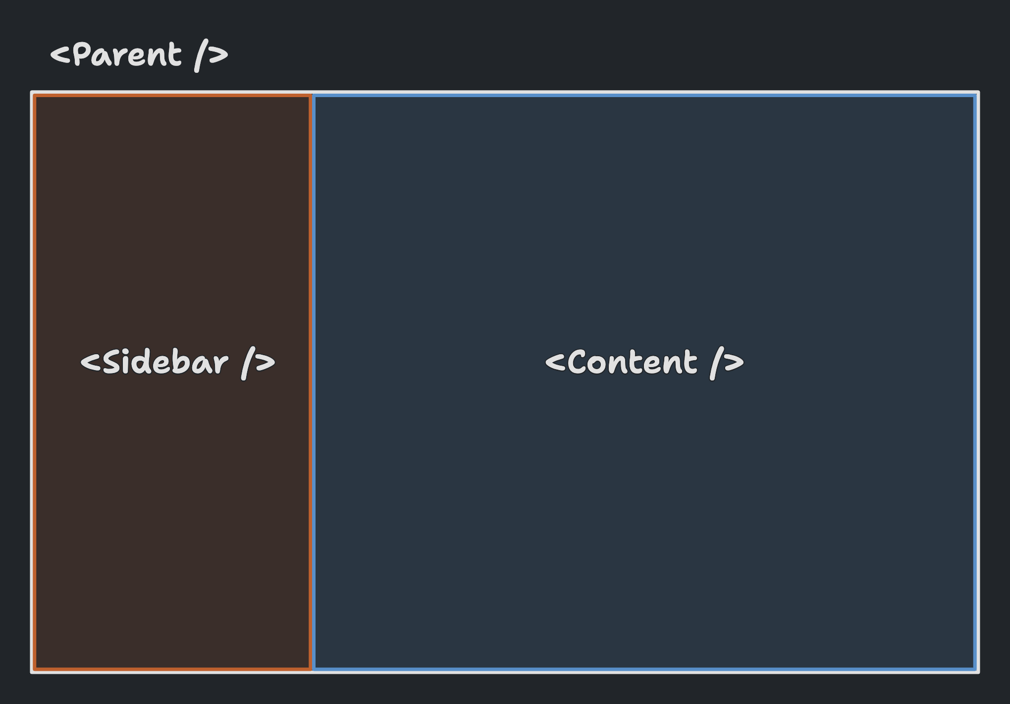
There’s just one final improvement that we can do to make it even better! Let us first think of our UI as higher-level components now(a concept that is common in most JS frameworks today).

Pretty simple right? The main question to ask here is who should be in control of the width of the <Sidebar /> component? Should the <Sidebar /> itself define it? Or expose it to the consumer(<Parent /> component here)?
If I got this question when I was learning React.js a few years back, I would have answered - well obviously the <Sidebar /> component should control it. After all, it’s a property of the sidebar and the consumer doesn’t have to bother setting this low-level detail. But is this understanding right? Probably not!
Sidebar width is something that affects not just the sidebar but also the rest of the contents on the page. It is something I like to call a “Positioning prop”(for a lack of a better term). Things like margin, width, height, etc. are independent of what a component encapsulates. A component can have whatever content within it, but the consumer of that component should have the control to change its positioning as needed to match with the rest of the page. This also leads to more reusable components that are flexible in their positioning.
Also, think of a more advanced use case. Something like Discord which has multiple sidebars left and right(literally). The sidebar widths would be scattered across all components. Now try making it responsive, and you would have a hard time keeping track of all the sidebar widths at different breakpoints at once without going through each component file again. The solution to this problem is to let the <Parent /> component which defines the general layout of the page control the widths of these sidebars and the rest of the content. All styles related to “Positioning” at one single place! This is what the final approach solves!
🤩 Approach 4: The stick to the grid way
The best approach according to me is to use CSS Grids to define the general layout of the page and then use position sticky to position the sidebar so that it fills in the layout defined by the grid and also remains fixed while scrolling. This approach elegantly solves the problem of who defines the “width” of the sidebar and moves layout related styling to a single place making our components independent of “Positioning props”(If you have no idea what this means because you were impatient, just read through the previous approach if you have time 🙂).
That was the single sidebar layout we were going for. This approach also works well when you have multiple sidebars like Discord. Here’s an example.
Yay! Let’s take a step back and see what we did in this approach differently:
- Used position
stickyon sidebar element to position it on the left side. - Made the parent a
gridwith the definition of columns usinggrid-template-columns.
No more “scroll hack” or “width-margin synchronizations”. Just a clean setup that not only works as expected but is also easy to develop and maintain in the long run. The parent has all the control about how wide each sidebar is, and can be easily updated across breakpoints to show/hide different sidebars.


