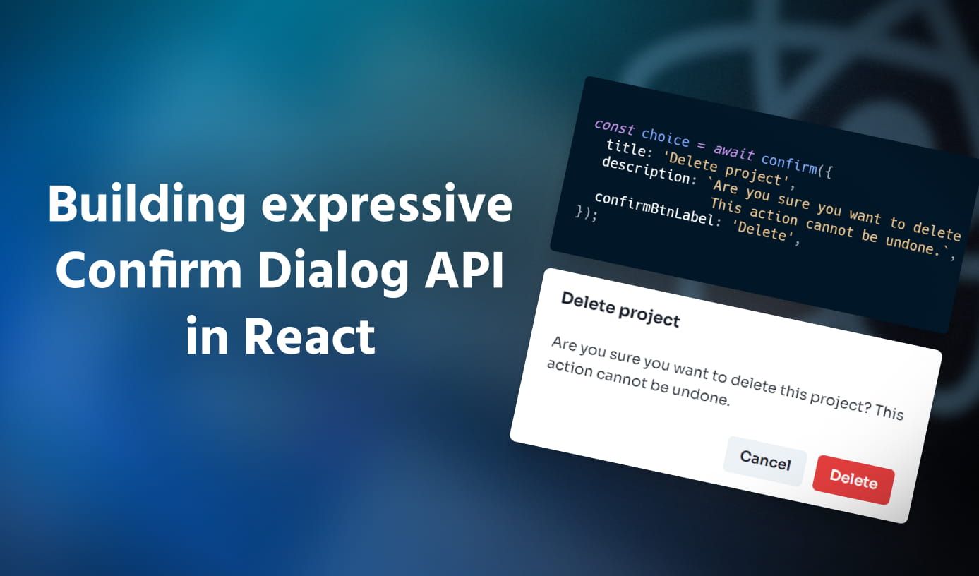
Building an expressive API for custom confirm dialogs in React
•8 min read
Confirm Dialogs are one of the most common user interactions seen in today’s apps when the user tries to perform some
critical action that cannot be undone. I’m sure you would have come across something like this before, be it the dialog
you see while deleting a repo on GitHub, or a project on Google Cloud platform, they are fundamentally this interaction.
In fact, all browsers have a native API built around this called
A simple Confirm Dialog in React
Building a simple Confirm Dialog component is easy in React. Just build it on your existing Modal component or something
new altogether. Imagine I have an <Alert /> component which takes the following props:
1<Alert2isOpen={true} // Whether the dialog is open3onClose={() => {}} // Event when user closes the dialog or clicks on 'Cancel'4title="" // Title of the dialog5description="" // Description text of the dialog6confirmBtnLabel="" // Text shown in the button which "confirms" the action7onConfirm={() => {}} // Event when user "confirms" the action8/>
It is quite easy to use this component as a consumer to show a Confirm Dialog. Just include it in your component code and
add some extra state that controls the visibility. Then toggle this state in appropriate event handlers and perform the
critical mutation only when onConfirm event of <Alert /> fires. This is how it looks:
1function Demo() {2const [showAlert, setShowAlert] = useState(false);34const handleDeleteAll = () => {5// Perform your dangerous critical action here.6// Remember to close your alert7setShowAlert(false);8};910return (11<Button onClick={() => setShowAlert(true)}>12Delete all13</Button>1415<Alert16isOpen={showAlert}17onClose={() => setShowAlert(false)}18title="Delete all"19description="Are you sure you want to delete everything?"20confirmBtnLabel="Yes"21onConfirm={handleDeleteAll}22/>23);24}
Works right? Of course, it does. But let’s take a closer look at the flaws in the structure of the code above:
- The actual call to the function that performs the dangerous action has moved from the event which would have initiated it, to
the
onConfirmhandler of the<Alert />component, and it only sets the respective Confirm Dialog to be visible.
This is not a good thing to have especially from a code readability and maintenance perspective. If you try to find which action the<Button>is actually performing, you would have to find the state variable it is changing, then the corresponding<Alert />component that is using this state, then look at the function it is calling inonConfirmevent. Too many dependencies and indirect coupling. - Remembering to hide the dialog when you are done with your action. Notice on line 8 you have to remember to close the dialog once its job is done. You also have to repeat that same call on line 19. The consumer is responsible for controlling the visibility of the Confirm Dialog even though it is such a one-time thing with a fixed entry and exit flow.
- Reusable component? Think again. The
<Alert />component encapsulates the UI to be shown and makes it reusable, but leaves the functionality to the consumer. Imagine adding more Confirm Dialogs to the same component and you’ll have a bunch of<Alert />and corresponding state variables and the calls to their setters littered in your component code.
Inspiration
Looking around for inspiration on what an ideal Confirm Dialog API could look like, I just so happened to stumble across the browser
native window.confirm() API, which has been there since like forever! I did not expect it to work out in this scenario, thinking it’s
too rigid and not very flexible. But I took a chance and refactored my code to use this API, to see how my code would be structured if
I had a similar API but to show my custom Confirm Dialog.
After modifying the above, this is what we get:
1function Demo() {2const handleDeleteAll = () => {3const choice = window.confirm(4'Are you sure you want to delete everything?'5);6if (choice) {7// Perform your dangerous critical action here.8}9};1011return <Button onClick={handleDeleteAll}>Delete all</Button>;12}
That’s it! A single one-liner that just replaced like 40-50% of my old code. If you don’t know how
- The function takes a string message that will be shown to the user in the dialog.
- The dialog has two buttons - ‘Cancel’ and ‘Ok’.
- If the user clicks on ‘Ok’, the function returns
true, otherwisefalse.
After seeing this change, I knew this was the kind of API I wanted. It solves all the flaws of previous code and there are no extra
state variables or calls to setters to change the visibility of anything. All that is taken care of by the confirm method itself.
Apart from the readability benefits, this API also makes it very easy to add Confirm Dialog behavior to existing functions. Just add a function call and a guard to the critical mutation to run it only when the user clicks on ‘Ok’.
The only thing I wanted in this API was a higher degree of customizability of the Confirm Dialog shown to the user. This was easier with
the previous approach thanks to the props exposed by the <Alert /> component.
Let’s build the API
One thing I immediately realized was to have a shared <Alert /> component across my entire app instead of having multiple
<Alert />s spread across many components. This decision was mainly because at any point in time, the user would only get to see one
Confirm Dialog. There will not be a situation when there are two Confirm Dialogs shown to the user at the same time(at least for my use case).
Having a shared <Alert /> at a higher level would keep the logic of managing the visibility of the component at one place and make
it easier for other components to “hook” into using this functionality when needed. This can be done using React Context. We can
create a context provider that would manage the rendering of the Confirm Dialog and also expose a function that other components could
“hook” into to use it.
1import { createContext, useContext, useState } from 'react';23const ConfirmDialog = createContext();45export function ConfirmDialogProvider({ children }) {6const [state, setState] = useState({ isOpen: false });78return (9<ConfirmDialog.Provider value={setState}>10{children}11<Alert isOpen={state.isOpen} />12</ConfirmDialog.Provider>13);14}1516export default function useConfirm() {17return useContext(ConfirmDialog);18}
Just with this context setup, the consumer can now use the useConfirm hook to programmatically show the Confirm Dialog in a function call.
1import useConfirm from './ConfirmDialog';23function Demo() {4const confirm = useConfirm();56const handleDeleteAll = () => {7confirm({ isOpen: true });8// Perform your dangerous critical action here.9};1011return <Button onClick={handleDeleteAll}>Delete all</Button>;12}
This brings us one step closer to the window.confirm() API, but there is no option to close the Confirm Dialog or show some custom
title and description. Right now we are only allowing the consumer to control the isOpen prop of the shared <Alert /> component,
can we update it to allow passing other props like title and description? Also, do we really want the consumer to set isOpen: true
every time they want to show the Confirm Dialog? It’s clear that when the consumer is calling confirm(), they want to implicitly show
the dialog. Let’s make these changes now.
1import { useState } from 'react';23export function ConfirmDialogProvider({ children }) {4const [state, setState] = useState({ isOpen: false });56const confirm = (data) => {7setState({ ...data, isOpen: true });8};910return (11<ConfirmDialog.Provider value={confirm}>12{children}13<Alert {...state} />14</ConfirmDialog.Provider>15);16}
We have created a new function called confirm in the context provider’s wrapper component which takes the props for <Alert />
as arguments and stores it in the local state along with setting isOpen to true. We then pass this function as a value of the
context and update the <Alert /> component to spread all the values of state as props.
Now the consumer can simply call the confirm() function and set the title, description, and other props as they prefer without
having to explicitly set isOpen to true.
1import useConfirm from './ConfirmDialog';23function Demo() {4const confirm = useConfirm();56const handleDeleteAll = () => {7confirm({8title: "Delete all",9description: "Are you sure you want to delete everything?",10confirmBtnLabel: "Yes",11});1213// Perform your dangerous critical action here.14};1516return (17<Button onClick={handleDeleteAll}>18Delete all19</Button>20);21}
While the presentational aspects of the Confirm Dialog work as intended, we still don’t have the functionality working. How do we
capture the user’s interaction on the Confirm Dialog(whether they confirmed or canceled their action)? How do we pause the execution
at the point where the caller calls confirm() and resume only when the user has performed some interaction? This is where I hit a
roadblock. I just couldn’t figure out a simple solution that would pause/resume the execution of a function and also return the user’s
choice some point later when they perform the action.
Thinking about the pause/resume behavior I was trying to build, confirm method to return a Promise
that the consumer can await on.
1import { useState } from 'react';23export function ConfirmDialogProvider({ children }) {4const [state, setState] = useState({ isOpen: false });56const confirm = (data) => {7return new Promise((resolve) => {8setState({ ...data, isOpen: true });9});10};1112return (13<ConfirmDialog.Provider value={confirm}>14{children}15<Alert {...state} />16</ConfirmDialog.Provider>17);18}
With the promise in place, when do we resolve the promise? Remember, we only want the execution of the caller to continue when the
user has performed the interaction with the Confirm Dialog. How do we capture the interaction with the Confirm Dialog? Using the already
existing event props(onClose and onConfirm in my case). So in summary, the promise should be resolved through the event handler passed
to onClose and onConfirm. Let’s add a ref which will store this event handler function. We will create this function within the Promise
handler in line 11 so that we have access to the resolve() method of the Promise.
1import { useRef, useState } from 'react';23export function ConfirmDialogProvider({ children }) {4const [state, setState] = useState({ isOpen: false });5const fn = useRef();67const confirm = (data) => {8return new Promise((resolve) => {9setState({ ...data, isOpen: true });1011fn.current = () => {12resolve();13setState({ isOpen: false });14};15});16};1718return (19<ConfirmDialog.Provider value={confirm}>20{children}21<Alert22{...state}23onClose={() => fn.current()}24onConfirm={() => fn.current()}25/>26</ConfirmDialog.Provider>27);28}
Notice how on line 13, we also set isOpen to false to automatically close the dialog once the user has performed some interaction.
Now the open and close functionality of the alert dialog works as expected, but the caller of confirm() function does not get any data
about the user’s choice. window.confirm() returns a boolean indicating whether the user confirmed their action, so let us also pass
some data to resolve() indicating the user’s confirmation which the caller would be able to use. This is a straightforward change,
where we update our event handler function stored in fn ref to also take a choice as an argument and resolve the promise with this choice.
1import { useRef, useState } from 'react';23export function ConfirmDialogProvider({ children }) {4const [state, setState] = useState({ isOpen: false });5const fn = useRef();67const confirm = (data) => {8return new Promise((resolve) => {9setState({ ...data, isOpen: true });10fn.current = (choice) => {11resolve(choice);12setState({ isOpen: false });13};14});15};1617return (18<ConfirmDialog.Provider value={confirm}>19{children}20<Alert21{...state}22onClose={() => fn.current(false)}23onConfirm={() => fn.current(true)}24/>25</ConfirmDialog.Provider>26);27}
And the component code which uses the useConfirm hook to show the Confirm Dialog can also be updated like this
1import useConfirm from './ConfirmDialog';23function Demo() {4const confirm = useConfirm();56const handleDeleteAll = async () => {7const choice = await confirm({8title: "Delete all",9description: "Are you sure you want to delete everything?",10confirmBtnLabel: "Yes",11});1213if (choice) {14// Perform your dangerous critical action here.15}16};1718return (19<Button onClick={handleDeleteAll}>20Delete all21</Button>22);23}
Try to go trace the above code once from confirm() method call to understand how it is working. And look at where we have ended
up in our Demo component. The code is very similar to the version using window.confirm() method, but we get the flexibility and
customizability of showing our own Confirm Dialog.
Finally, let’s optimize the confirm() method in ConfirmDialogProvider to not be instantiated on every render and prevent un-necessary
re-renders of consumers. This can be done by using React’s confirm(), the only dependency is setState method.
1import {2createContext,3useCallback,4useContext,5useRef,6useState,7} from 'react';89const ConfirmDialog = createContext();1011export function ConfirmDialogProvider({ children }) {12const [state, setState] = useState({ isOpen: false });13const fn = useRef();1415const confirm = useCallback(16(data) => {17return new Promise((resolve) => {18setState({ ...data, isOpen: true });19fn.current = (choice) => {20resolve(choice);21setState({ isOpen: false });22};23});24},25[setState]26);2728return (29<ConfirmDialog.Provider value={confirm}>30{children}31<Alert32{...state}33onClose={() => fn.current(false)}34onConfirm={() => fn.current(true)}35/>36</ConfirmDialog.Provider>37);38}3940export default function useConfirm() {41return useContext(ConfirmDialog);42}
That’s the final code snippet! Glad you made it this far. 🥳
It’s almost magical how easy the above API is to use now, where the component is not bothered about how/where the Confirm Dialog is rendered, it just invokes the dialog and uses the data it returns. Adding this Confirm Dialog functionality now to any other function is also straightforward without requiring much code changes, and also fits in well with your existing async calls to API mutations.
Conclusion
This was my journey of building the expressive API for using Confirm Dialog in React inspired by the native window.confirm method.
I’m not sure what this pattern is called, but I like to call them “Callable components” and I think they can be applied to a variety
of components that actually live at some place but can be programmatically invoked simply by calling a function. Toasts, Alerts, and
Confirm Dialogs are some components that become very easy to use with this pattern. I hope you found this article useful and inspired
you to create component APIs that go beyond making components composable and expose the functionality of the component over a non-traditional abstraction.


