Expandable tags with Framer Motion and React
•8 min read
Changing the content of an element when user hovers over them
Hover-related styling is very straightforward with CSS because of the :hover pseudo-selector, but it’s not very clear how the content of an element can be changed on hover. Thankfully, JavaScript exposes two events - onMouseEnter and onMouseLeave which get fired when the mouse enters(hovers) an element or leaves(unhovers) the element respectively. These events can be used to update a state variable in React which is then used to conditionally render the content of the element.
1function ExpandableTag({ unhoveredText, hoveredText }) {2const [isHovering, setIsHovering] = useState(false);3return (4<div5className="inline-block rounded-lg relative text-gray-300 bg-gray-900 ring-1 ring-gray-800 px-4 py-1.5 tracking-wider text-sm font-medium whitespace-nowrap"6onMouseEnter={() => setIsHovering(true)}7onMouseLeave={() => setIsHovering(false)}8>9{isHovering ? hoveredText : unhoveredText}10</div>11);12}
We have a basic implementation of the component ready, but there are two problems:
- There is no animation. The content changes instantly which might not be a good UX in this scenario and some subtle animation can polish this component even more.
- The dreaded flicker of doom. This is a hard one to catch but in a case where your hovered text is lesser than the unhovered text, the user can cause the component to enter into a flickering state where the content of the component changes continuously.
Adding fade-in / out animation to the content
To solve the first problem, let’s start by adding simple fade-in and fade-out on the changing content within the tag. When the user hovers over the tag, the unhovered text fades out and hovered text fades in. This plays in reverse when the user hovers out. This is very easy to do in Framer Motion with the motion component and the AnimatePresenceAnimatePresence component should be used whenever there is an exit animation defined for the motion component. In our case, this would be the fade-out animation when the content is exiting the UI.
1function ExpandableTag({ unhoveredText, hoveredText }) {2const [isHovering, setIsHovering] = useState(false);3return (4<div5className="inline-block rounded-lg relative text-gray-300 bg-gray-900 ring-1 ring-gray-800 px-4 py-1.5 tracking-wider text-sm font-medium whitespace-nowrap"6onMouseEnter={() => setIsHovering(true)}7onMouseLeave={() => setIsHovering(false)}8>9<AnimatePresence>10<motion.span11initial={{ opacity: 0 }}12animate={{ opacity: 1 }}13exit={{ opacity: 0 }}14>15{isHovering ? hoveredText : unhoveredText}16</motion.span>17</AnimatePresence>18</div>19);20}
This alone does not solve the problem, Framer Motion does not know when your animations should run, so by default, it only runs when the component is first mounted. We want the animation to run when the user hovers and unhovers the element(as that is when the contents change), and this is already tracked by the isHovering state variable. To tell Framer Motion to run the animations, we can simply set the key prop such that it changes when we want the animations to run. In our case, that would be setting the key to something based on isHovering state variable.
Also, since we don’t want the entry animations to run when the component is first mounted, we can opt out of this behavior by setting the initial prop in the AnimatePresence component to false
1function ExpandableTag({ unhoveredText, hoveredText }) {2const [isHovering, setIsHovering] = useState(false);3return (4<div5className="inline-block rounded-lg relative text-gray-300 bg-gray-900 ring-1 ring-gray-800 px-4 py-1.5 tracking-wider text-sm font-medium whitespace-nowrap"6onMouseEnter={() => setIsHovering(true)}7onMouseLeave={() => setIsHovering(false)}8>9<AnimatePresence initial={false}>10<motion.span11initial={{ opacity: 0 }}12animate={{ opacity: 1 }}13exit={{ opacity: 0 }}14key={isHovering ? 'hovering' : 'unhovering'}15>16{isHovering ? hoveredText : unhoveredText}17</motion.span>18</AnimatePresence>19</div>20);21}
But wait, the contents fade in and out simultaneously
The contents of the tag fade in and out simultaneously in the above code because, by default, Framer Motion synchronizes the entry and exit animations on motion components. This is useful in various scenarios, but it does not look good for this use case. We can change this behavior by changing the modeAnimatePresence component from "sync" (default value) to "wait", which runs the entry animations only after the exit animations have completed.
1// rest...2<AnimatePresence mode="wait" initial={false}>3<motion.span4initial={{ opacity: 0 }}5animate={{ opacity: 1 }}6exit={{ opacity: 0 }}7key={isHovering ? 'hovering' : 'unhovering'}8>9{isHovering ? hoveredText : unhoveredText}10</motion.span>11</AnimatePresence>12// rest...
We now have our contents fading in and out when the user hovers and unhovers the element. This is already way better than what we started from!
Smooth resizing of the tag container element
While the fade-in and fade-out are good additions, the container element of the tag still resizes instantly when the contents change. This is a jarring experience for the user as too many unsynchronized changes are happening in the UI at once. To make this better, we must smoothly resize the container and synchronize it with the content fade in/out.
This might seem hard as animating the width of an element is not a cheap operation as it runs on the CPU and causes expensive layout calculations for every frame of the animation. But hey, since we are using Framer Motion, we don’t have to worry about it! Framer Motion makes these complex layout animations very easy by making use of CSS transforms to animate the size and positioning of elements that run on the GPU, thus making the animations buttery smoooooth!
Opting into layout animations is simple, we have to change the container element to motion.div component (instead of HTML div) and set the layoutlayout prop takes "position" and "size" if we are interested in only animating the position or size of the element respectively. If we want to animate both position and size, then the layout can be set to true. Another change we have to do is to wrap the component with LayoutGroup
1function ExpandableTag({ unhoveredText, hoveredText }) {2const [isHovering, setIsHovering] = useState(false);3return (4<LayoutGroup>5<motion.div6layout7className="inline-block rounded-lg relative text-gray-300 bg-gray-900 ring-1 ring-gray-800 px-4 py-1.5 tracking-wider text-sm font-medium whitespace-nowrap"8onMouseEnter={() => setIsHovering(true)}9onMouseLeave={() => setIsHovering(false)}10>11<AnimatePresence mode="wait" initial={false}>12<motion.span13initial={{ opacity: 0 }}14animate={{ opacity: 1 }}15exit={{ opacity: 0 }}16key={isHovering ? 'hovering' : 'unhovering'}17>18{isHovering ? hoveredText : unhoveredText}19</motion.span>20</AnimatePresence>21</motion.div>22</LayoutGroup>23);24}
A quirk of how layout animations are done in Framer Motion is that it may affect some of your other CSS properties – border-radius, box-shadow, etc. This is because the layout animations use CSS Transforms under the hood and they in turn cause some unintended side effects on how the styles of these properties get rendered. To fix this, we should pass border-radius as an inline style to a motion component using layout animations, instead of setting it in a CSS file somewhere else. This would allow Framer Motion to perform additional calculations that nullify the effect of CSS Transforms on these properties.
1// rest...2<motion.div3layout4className="inline-block relative text-gray-300 bg-gray-900 ring-1 ring-gray-800 px-4 py-1.5 tracking-wider text-sm font-medium whitespace-nowrap"5style={{ borderRadius: 8 }}6onMouseEnter={() => setIsHovering(true)}7onMouseLeave={() => setIsHovering(false)}8>9{/* rest of the children */}10</motion.div>11// rest...
With this change, we now have a component that has smooth animations on all kinds of user interactions and improves the overall UX. This solves the first problem.
Solving the dreaded flicker of doom
The second problem is the flickering of the tag when the user hovers towards the edge of the component where the hovered text is lesser than the unhovered text. This flickering happens when the side-effect of one event triggers another event which resets the changes from the side-effect, but it also ends up triggering the event causing that side-effect. Essentially an indirect recursion but with JavaScript events causing annoying UI glitches.
With animations in place, the effects of these flickers are greatly reduced but it’s still an underlying problem that should be solved. The solution to this problem requires extracting out all the interaction events (onMouseEnter and onMouseLeave) to an element whose size does not change since changes in the size of the element with interaction events were causing the infinite recursion. And to prevent this new element from shrinking when the content shrinks, we can set the min-width of this element to be the width of the tag element when it is in the unhovered state. This will ensure that the element with interaction events never shrinks when the user has triggered the hover interaction but not the unhover interaction.
1function ExpandableTag({ unhoveredText, hoveredText }) {2const width = useRef(0);3const ref = useRef();4const [isHovering, setIsHovering] = useState(false);5return (6<LayoutGroup>7<div8className="inline-block"9style={{ minWidth: width.current }}10onMouseEnter={() => {11width.current = ref.current.offsetWidth;12setIsHovering(true);13}}14onMouseLeave={() => setIsHovering(false)}15>16<motion.div17ref={ref}18layout19className="inline-block relative text-gray-300 bg-gray-900 ring-1 ring-gray-800 px-4 py-1.5 tracking-wider text-sm font-medium whitespace-nowrap"20style={{ borderRadius: 8 }}21>22{/* rest of the children */}23</motion.div>24</div>25</LayoutGroup>26);27}
That solves the flickering problem! We have come quite far from where we started and there are just a few minor issues to solve to make our component even better!
Fixing a few more minor issues
Fast hover and unhover cause inconsistent UI
Try hovering and then unhovering your tag component fast. The expandable tag may render the hovered state UI when you have unhovered the component. This UI inconsistency stems from a regression in recent versions of Framer Motion –
If the above GitHub issue is closed with a bug fix when you are reading this or you are not experiencing this problem in newer versions of Framer Motion, feel free to skip this section of the post.
If you are facing this problem, then the only workaround right now is to downgrade to a version of Framer Motion where this bug wasn’t there 😕, and this happens to be version 9.0.2. Downgrading to this version solves the problem, without requiring any code change!
Using the component with the rest of the UI causes stray layout gaps
When the expandable tag component is used with the rest of the larger UI, and the user hovers over and unhovers the tag, there can be some instances where the component causes stray layout gaps in the UI. This is because the interaction element that we added to solve the flicker problem may capture the size of the tag in its hovered state when we are interested in the size of the tag in its unhovered state. So, we can add a guard to only capture the width when the isHovering state variable is false.
1// rest...2<div3className="inline-block"4style={{ minWidth: width.current }}5onMouseEnter={() => {6if (!isHovering) {7width.current = ref.current.offsetWidth;8}9setIsHovering(true);10}}11onMouseLeave={() => setIsHovering(false)}12>13{/* rest of the children */}14</div>15// rest...
Changing the JS events to Framer Motion gesture callbacks
This is an optional change, since hover interactions are only defined on devices that have a pointer, it does not make sense to use them on touch devices like tablets and mobiles. To disable them from running on touch devices, we can remove the onMouseEnter and onMouseLeave events and instead use Framer Motion’s onHoverStart and onHoverEnd.
1function ExpandableTag({ unhoveredText, hoveredText }) {2// rest...3return (4<LayoutGroup>5<motion.div6className="inline-block"7style={{ minWidth: width.current }}8onHoverStart={() => {9if (!isHovering) {10width.current = ref.current.offsetWidth;11}12setIsHovering(true);13}}14onHoverEnd={() => setIsHovering(false)}15>16{/* rest of the children */}17</motion.div>18</LayoutGroup>19);20}
With that last fix, we now have a powerful expandable tag component that has beautiful animations and can be used with the rest of the UI.
Magic of Framer Motion’s layout animations
The beauty of Framer Motion is how declarative it is for defining complex UI animations for React apps. Once you use the right primitives to build your components, synchronizing complex layout animations across them is as easy as wrapping your UI with just a LayoutGroup component. Framer Motion will figure out the triggers and effects of a layout animation on its own!
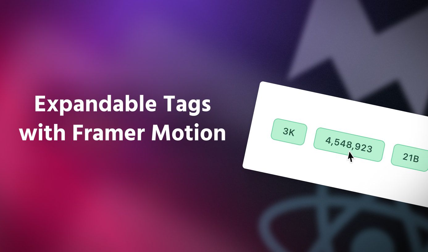
With the ExpandableTag component ready, let’s wrap a few instances of this component with a LayoutGroup and see it in action!
import { LayoutGroup } from 'framer-motion';
import ExpandableTag from './ExpandableTag';

function App() {
  return (
    <div className="h-screen bg-gray-950 flex items-center justify-center gap-4">
      <LayoutGroup>
        <ExpandableTag hoveredText="3,203" unhoveredText="3K" />
        <ExpandableTag hoveredText="4,548,923" unhoveredText="4.5M" />
        <ExpandableTag hoveredText="🦋🦋" unhoveredText="Butterflies" />
      </LayoutGroup>
    </div>
  )
}

export default App;
When a user hovers over a tag, the other tags also react with smooth animations to accommodate the changing size of the hovered tag. This would have been very hard to pull off with just CSS + JavaScript, but Framer Motion does all this while keeping our code simple and declarative. And this I feel is the true magic of Framer Motion! ✨
Final code
1import { useRef, useState } from 'react';2import { AnimatePresence, LayoutGroup, motion } from 'framer-motion';34function ExpandableTag({ unhoveredText, hoveredText }) {5const width = useRef(0);6const ref = useRef();7const [isHovering, setIsHovering] = useState(false);8return (9<LayoutGroup>10<motion.div11className="inline-block"12style={{ minWidth: width.current }}13onHoverStart={() => {14if (!isHovering) {15width.current = ref.current.offsetWidth;16}17setIsHovering(true);18}}19onHoverEnd={() => setIsHovering(false)}20>21<motion.div22ref={ref}23layout24className="inline-block relative text-gray-300 bg-gray-900 ring-1 ring-gray-800 px-4 py-1.5 tracking-wider text-sm font-medium whitespace-nowrap"25style={{ borderRadius: 8 }}26>27<AnimatePresence mode="wait" initial={false}>28<motion.span29initial={{ opacity: 0 }}30animate={{ opacity: 1 }}31exit={{ opacity: 0 }}32key={isHovering ? 'hovering' : 'unhovering'}33>34{isHovering ? hoveredText : unhoveredText}35</motion.span>36</AnimatePresence>37</motion.div>38</motion.div>39</LayoutGroup>40);41}4243export default ExpandableTag;


